Build Better Money Habits UX Design
Overview
Create responsive wireframes for an onboarding process.
Deliverables
Site Map
User Flows
Mid Fidelity Wireframes
Mid Fidelity Prototypes
Role
UX Research and Design
Timeframe
5 Weeks
Designing a signup and purchase experience for a children’s online course
The goal of the project was to develop a digital experience to take parents from learning about the the course to onboarding and receiving the course. Stakeholders wanted to create a process for parents to enroll in the course, as well as plan how to build and house marketing content, a resource library, and course materials.
The main challenge was creating an experience that could build enough trust with a parent to allow their children to use the service. Every design decision considered how trust for the product could be improved, while still moving the user towards successful purchase of the course.
Research Included: User Journey Map, Competitive Analysis, Card Sort, User Interviews.
The Problem
What do parents need to experience in order to trust an online service with their children?
Because of the time commitment and live aspects of the service, users need to build trust and familiarity with the product before they allow their children to use it.
The Process
Feature prioritization narrowed the project into essential user tasks to solve for.
01
Find the course
02
Enroll in the course
03
Access and complete course
Find the course
Enroll in the course
Access and complete course
Using information architecture to streamline course access and ease discovery
The first essential task for users was finding where to sign up for the course. Stakeholders needed an experience for users to learn about the course, so course content needed to be housed in a place that was discoverable for new users when entering the site.
Open card sorting was used to gain insights into how users would understand the mix of provided marketing and course content. Multiple users created content categories with “information” and “action” language, with similarities in sorting showing a clear mental model of action content versus static content.
I wanted the info to be separate from the actions...
“
– User 2 Card Sort Transcript
User Generated Category Labels
This insight drove the recommendation to combine action items (such as billing, sign up, and support) for both account and course content into a singular instance in the product. Additional testing was performed with wireframe prototypes to solidify the sitemap and navigation.
Find the course
Enroll in the course
Access and complete course
Building user trust in the product through the enrollment process
The second essential task for users was to purchase the course. Payment, personal information, contact information, account log in, and a confirmed start date were all required by stakeholders for users to access the course. I set out to better define the onboarding process for users, using the term “enrollment” and creating a set of clearly identified steps from the requirements outlined by stakeholders.
Finding user pain points
To understand where users might feel the most unsure or concerned in the process, a user journey map was leveraged so that pain points could be addressed more directly. Because the product is geared towards children, there were increased concerns around privacy, safety, and data collection. The goal was to create enough time to build trust and familiarity, without losing ease of use or creating frustration.
Through user testing, it became evident that getting through all the required onboarding steps was the largest bottleneck.
Pacing the disclosure of information to create assurance
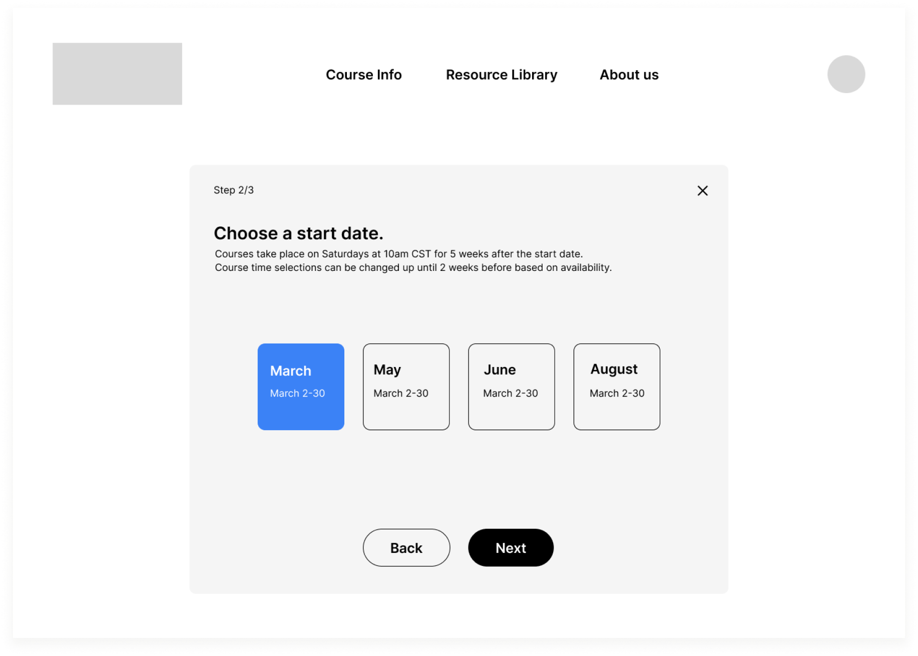
The client needed a way users could onboard and pay for the course. Multiple rounds of rapid sketching led to the recommendation that payment and additional onboarding requirements be streamlined into a single form flow, with the language “enrollment” to define the process
The best course of action was to require only email to access locked course content. All other requirements are combined into a single form with ability to save and exit so user can complete enrollment at their own pace.
Users can leverage a free account to explore what the course will entail, and how it will function before committing. Only minimal information is required for the free account, so that the user is not overwhelmed by the length of the process and amount of private information shared at once. All other onboarding criteria, such as billing info and desired start date, are combined into a single multi page form with options to save and exit so the user can determine their own pace.
Onboarding User Flow
Find where to enroll
Enroll in the course
Access and complete course
Creating encouragement and consistency across the user journey
Creation of wireframes enabled prototype testing of the minimum viable product. Along with a planned focus on repeated UI patterns, context cues and interactive elements were also developed to address pain points revealed in user tests.
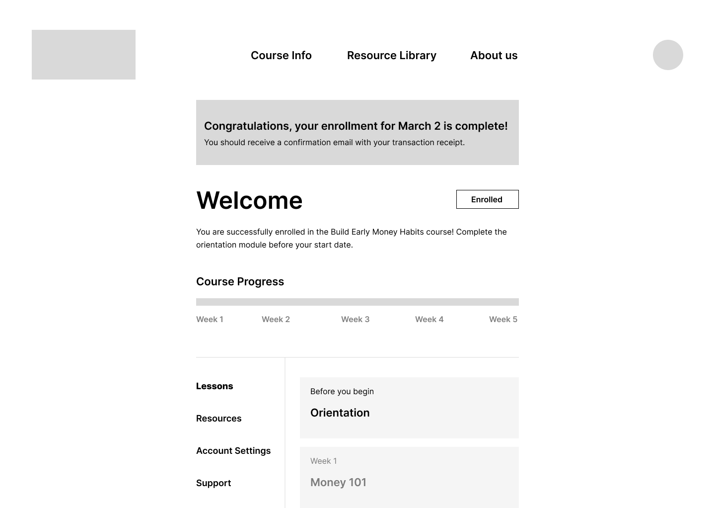
Dashboard elements populate with relevant data at different stages, and all content is visible even if not yet unlocked
A system of interactive elements was introduced for the dashboard design based on feedback from user testing
User test insight:
Not enough rewarding feedback
Stakeholder concern:
Not enough urgency for completion of purchase
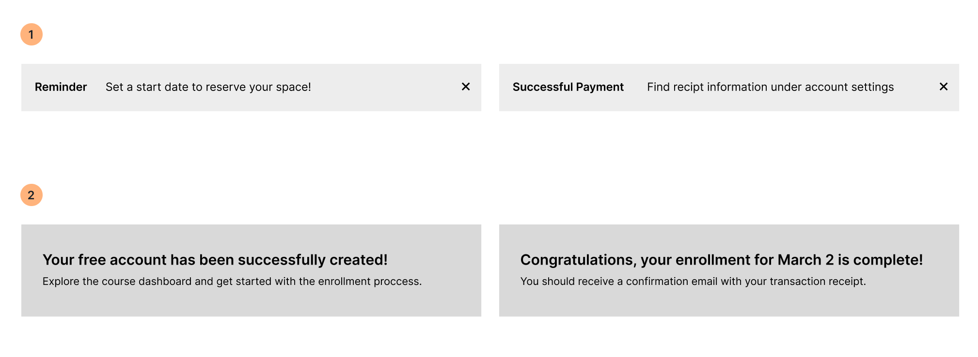
Recommendation:
1 Reminder pop up triggered by enrollment or course deadlines
2 Timed Banner triggered by Successful account updates
User test insight:
Uncertain of successful enrollment
Stakeholder concern:
Taking away attention from marketing site
Recommendation:
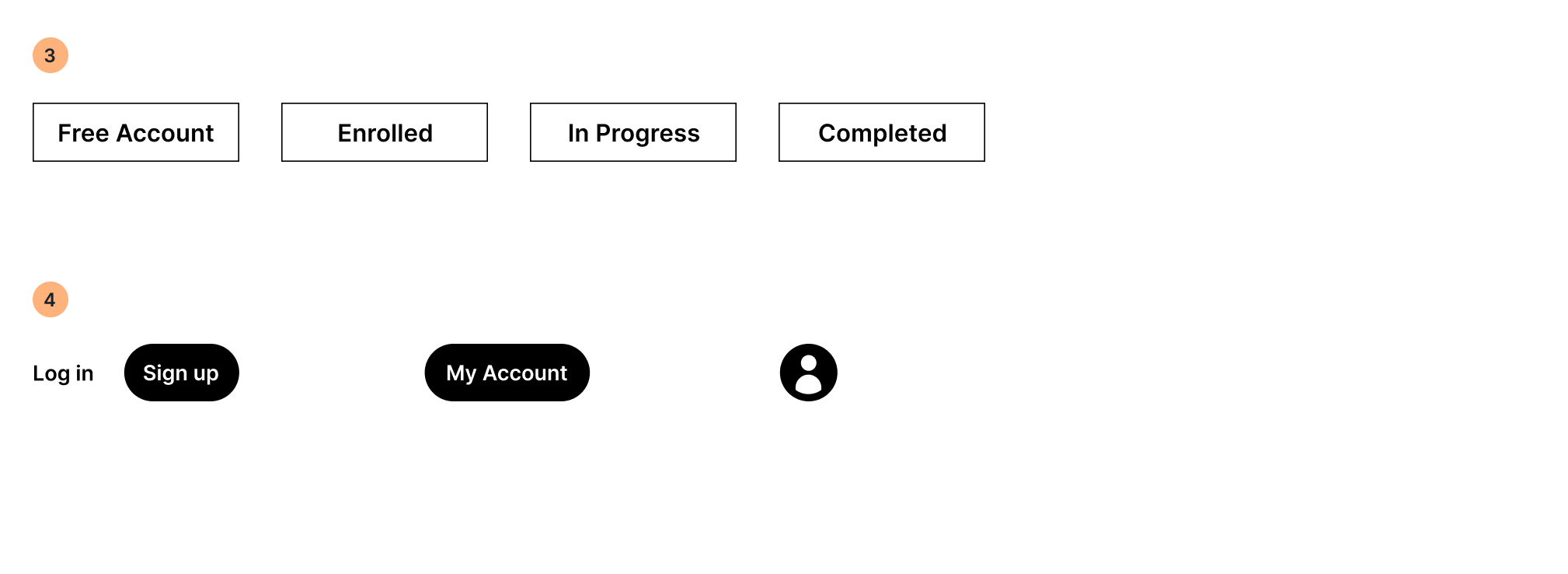
3 Account Status Tag
4 Account Button state in main navigation bar
Highlights from mid fidelity prototype
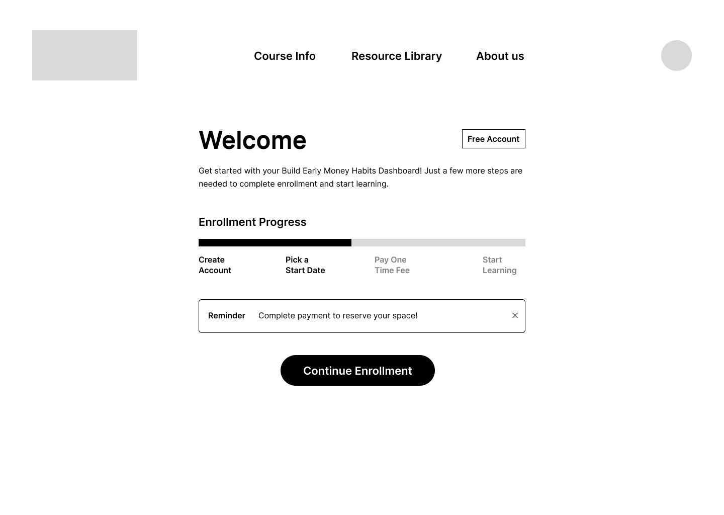
-
![]()
Enrollment started but not finished, progress bar updates and reminder triggered by last step completed by user
-
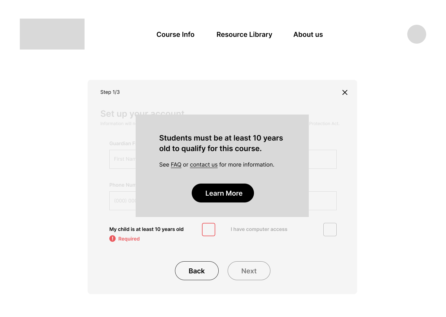
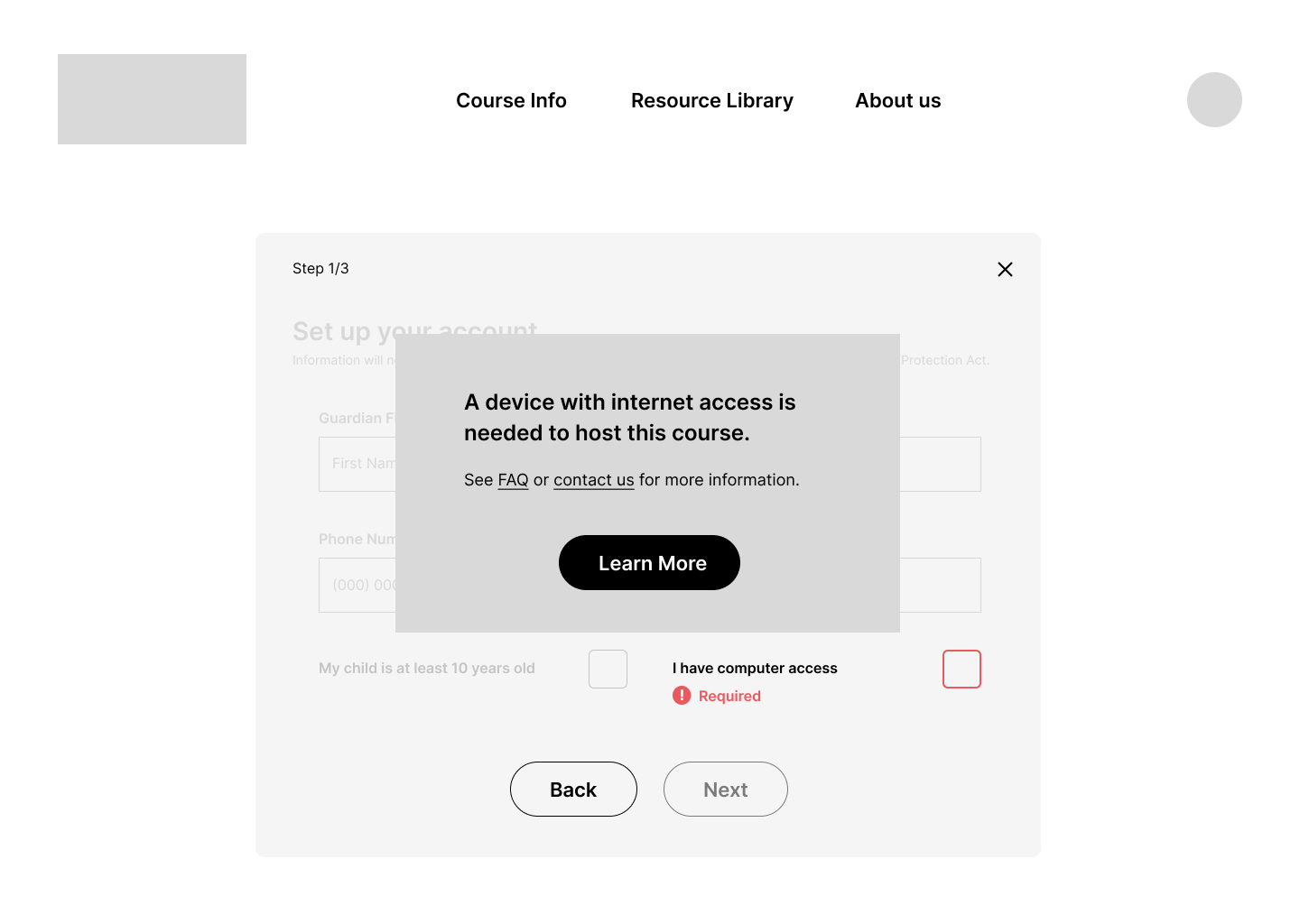
![]()
Error messages for course requirements appear as prominent pop ups
-
![]()
Copy provides reasons for inability to continue and giver users possible steps forward
-
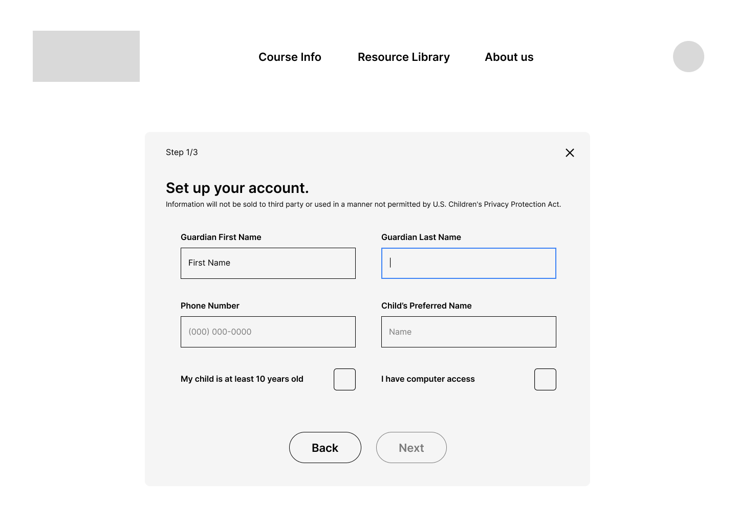
![]()
Focus state applied to clicked item, or next uncompleted item if screen clicked
-
![]()
Visual changes indicates Next button is clickable once form screen is successfully completed, next is always more prominent than back button to encourage user to move forward through screens
-
![]()
Pop up window gives confirms successful enrollment