Flatiron School Brand Refresh
Overview
Full brand refresh, creation of new assets and guidelines presented internally.
Deliverables
Updated Logo
Brand Guidelines
New Branded Templates
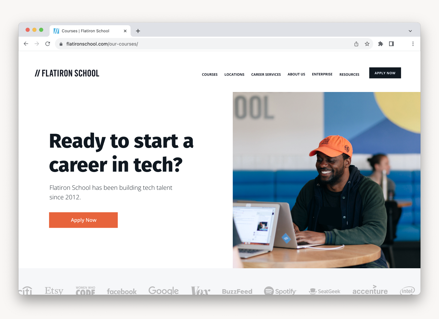
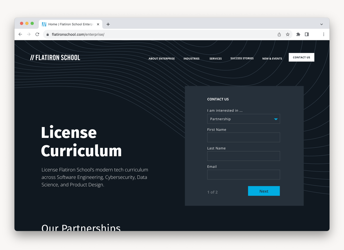
Website Design Updates
Role
Design
Visual systems needed to evolve with the brand, the company priorities, and its offerings.
Along with improving the existing consumer brand, new products needed expanded visual options. Growth on the enterprise side of the company required the development of a unique identity from the existing consumer branch, and multiple use cases required disciplines to be distinct from the general consumer brand.
We started by mapping out all of the product offerings to see where identities could be streamlined. We wanted to create a cohesive system so as not to dilute the brand.
Mapping brand architecture
Updated guidance on brand visual identities and usage.
Consumer
This identity addresses our widest audience and should be used for assets for consumer audiences, or any ambiguous, general-use material. This is the main brand identity, and will usually be the default.
Enterprise
Enterprise is the toned down and buttoned up version of the brand identity. This system is to be used when addressing the enterprise audience.
Discipline
Each discipline has a unique system. Use of these identities is limited to assets speaking to only one discipline at a time. This visual system is to be used sparingly, if the asset could be used for more than one of our offerings, default back to the consumer identity.
Core Brand Elements
We used competitive analysis, analytics, and interviews to identify areas of improvement and inform design decisions. Interviews with active students and alumni revealed a disconnect with existing visual elements and how the brand was perceived. We started by revisiting and bolstering our brand values for refreshing core elements of the brand.
Updating the Logo for More Balanced Layouts
The slashes of the existing logo are the greatest point of brand recognition, but the overhang of the logo mark and text made the logo difficult in layout. Alignment and kerning revisions created a more balanced logo that could be stacked and aligned with other elements.
Unifying Typography
Typography was generally inconsistent, with multiple typefaces in use accross different areas of the company. In order to create connection with previous brand iterations we decided to pull from an existing type pool, with adjustments to scale to create more dynamic feel and improve readability.
Brand Typefaces An audit of fonts used across the company narrowed down the selection based on audience research and improved readability.
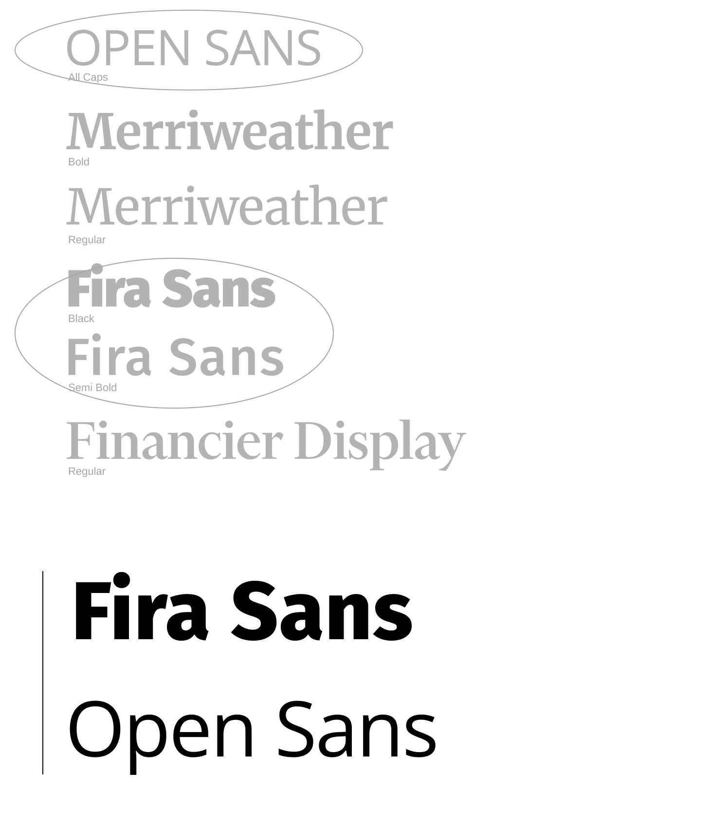
Typographic Hierarchy Adjusting hierarchy of the selected typefaces based on most frequent use cases.
Color Choices Honor the Brand Legacy and Create Flexibility for Future Change
The brand needed a palette that created more flexibility for assets created for students and the community.
An updated blue is is present through all palettes as the core brand color. Blue has been the primary brand color since Flatiron’s School’s founding in 2012 and allows the palette to lean into legacy while continuing to expand and grow.
Brand
Blue
#01ADE2
Consumer Palette
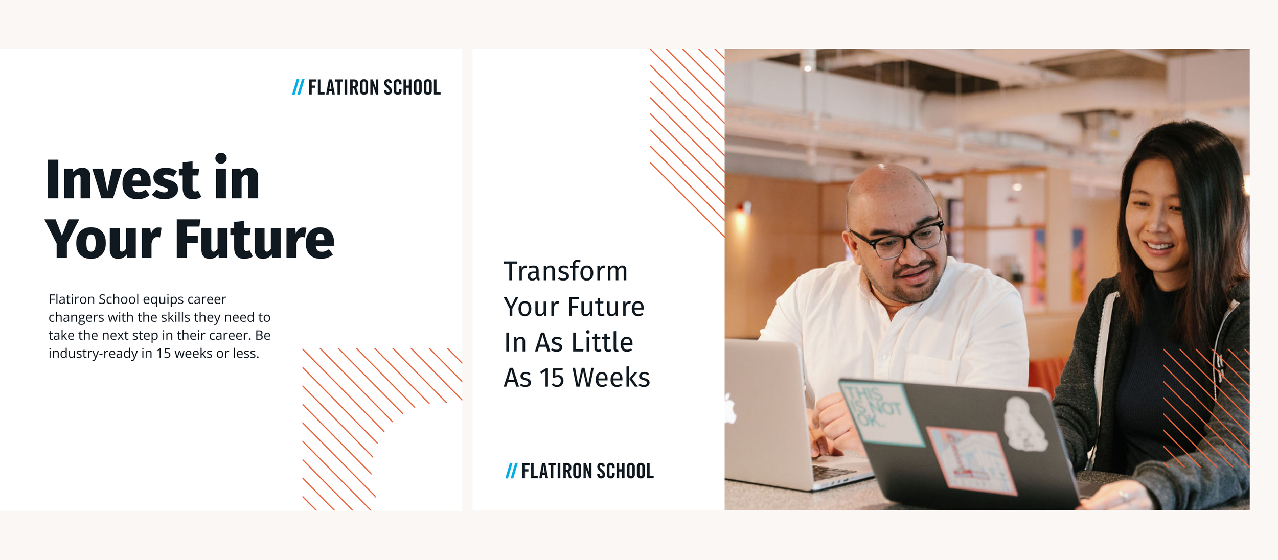
The consumer color palette leans into the warm and playful aspects of the brand. A lighter neutral palette allows the brand blue to stand out, with the addition of orange adding a bold and energetic contrast.
Enterprise Palette
The enterprise color palette leans into technical and professional aspects of the brand. A darker neutral palette allows the brand blue to stand out, and the addition of teal allows for more subtle contrast in graphic elements.
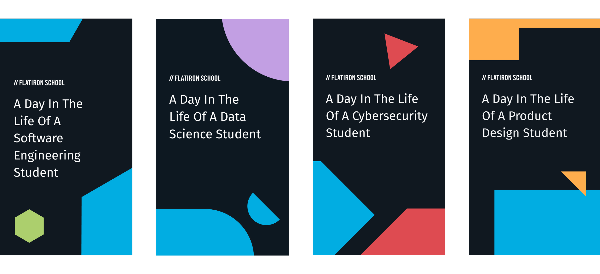
Discipline Palettes
Each disciplines have visually distinct palette options for instances where an additional level of separation is needed. Unique palettes help users better navigate through social channels identities create a sense of community and camaraderie among students.
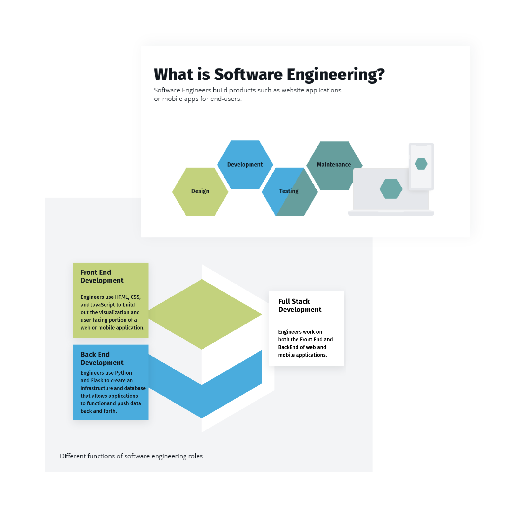
Software Engineering
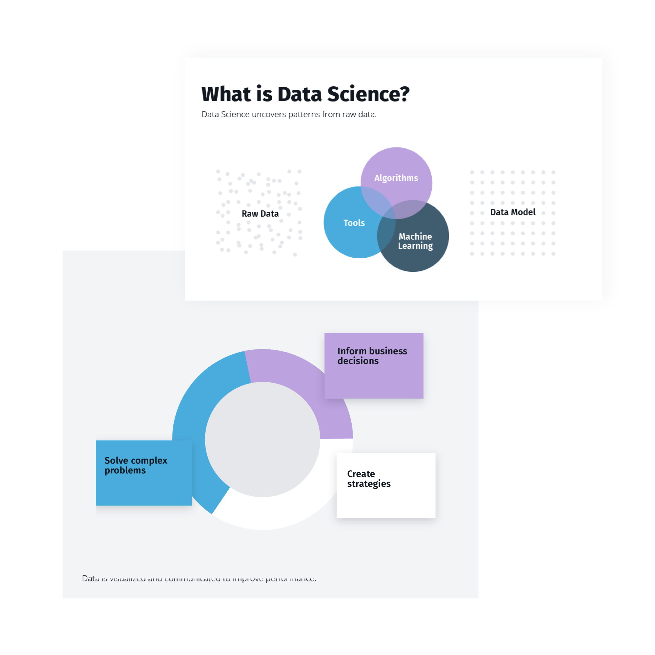
Data Science
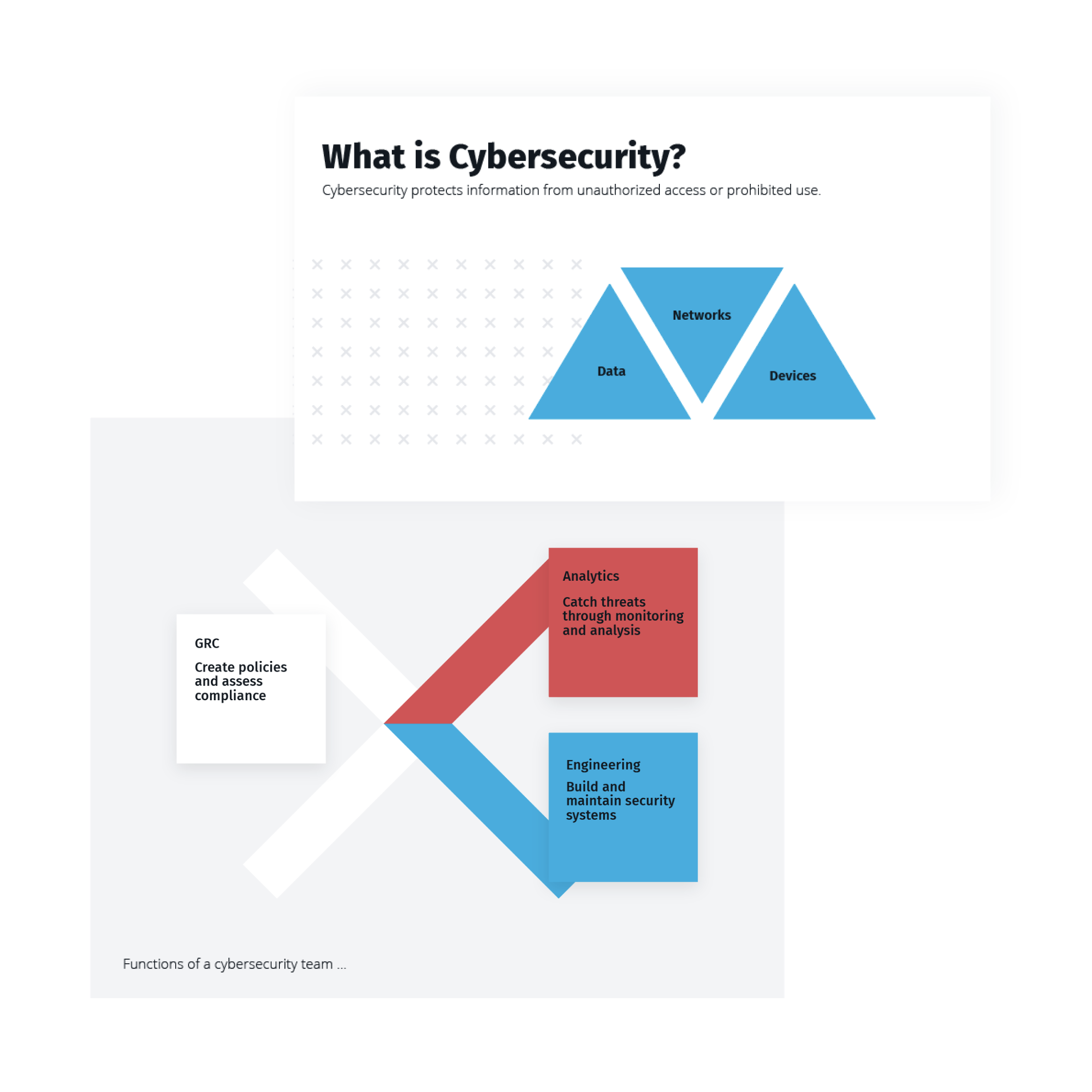
Cybersecurity
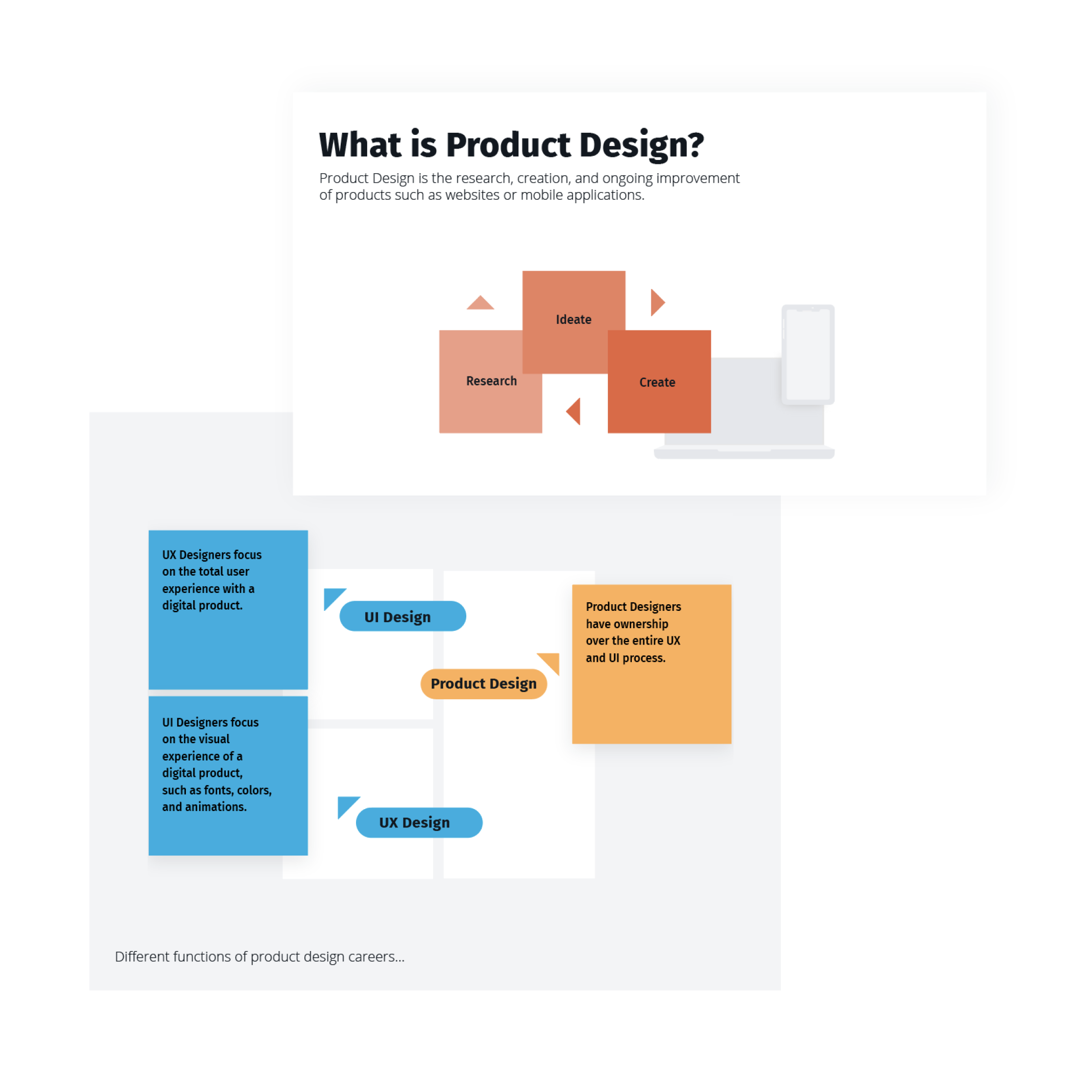
Product Design
Visual Language
Visuals put the brand voice - Flatiron School’s determination, ambition, and expertise - into a visible format. They highlight diversity and authenticity in our visuals, featuring open spaces and forward motion.
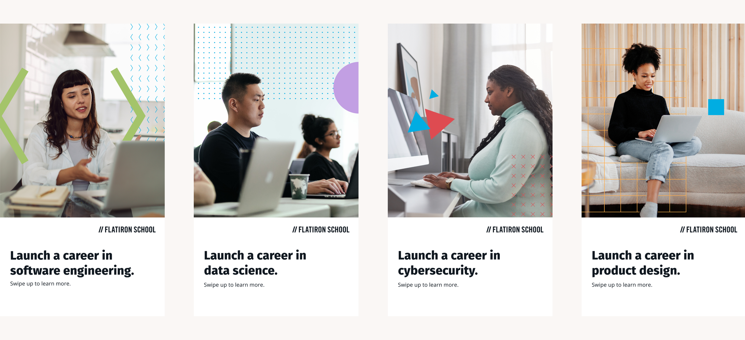
The graphic system contrasts bold shapes with technical patterns. The combination bridges the daily life of students to the technical education they are pursuing.
Distilling Curriculum Content for Shapes and Patterns
A research of imagery, symbols, relevant concepts, and industries of each discipline was performed. Sketches and exploration of how these concepts could be abstracted into simple shapes were then repeated into patterns and textures. This allowed a refinement of a system of shapes, symbols, and patterns that could be utilized.
Using Brand Shapes to Build Infographics
An infographic system represents a full range of colors included in brand palettes as well as the full suite of shapes. Creation of these systems was performed in collaboration with the curriculum team.
Cultivating Authenticity and Expertise through Photography
Photography guidelines and libraries for all product identities and platforms came next. A mix of stock and original photography were used, with instructions on how to use and select them. Curriculum and industry experts and personas were consulted for additional guidance on technical and industry specific considerations. It was important for the brand to maintain expertise, avoid industry cliches, and curb misconceptions to maintain credibility and accuracy.
Consumer Photography
Above all else, selected photography aims for authenticity. We primarily feature our students, highlighting the diversity of their representation, background, and lifestyle.
Similar to our consumer color palette, photography for consumer audiences mainly feature neutral tones of gray and black with pops of color to draw the eye to the subject.
Enterprise Photography
Enterprise takes a similar tone to universal, with light, neutral tones and authentic poses. Enterprise photography slants towards a high-tech, professional setting, with employees dressed in business casual attire. The colors are neutral with subtly contrasting cool tones.

Graphic Treatments
The options for graphic photo treatments allow for more flexibility and storytelling, especially when using stock photography.
Photo treatments overlay our system of shapes and patterns to connect a concept to each visual. They feature geometric leading shapes, moving the eye towards the subject of the image and creating visual interest.

Assests
Visuals put the brand voice - Flatiron School’s determination, ambition, and expertise - into a visible format. They highlight diversity and authenticity in our visuals, featuring open spaces and forward motion, our mission made real.
The graphic system contrasts bold shapes with technical patterns. The combination bridges the daily life of students to the technical education they are pursuing.